
I left the defects in on purpose
Every SaaS demo I've ever clicked runs on perfect data. Clean rows, nice round numbers, nothing out of place; data that doesn't exist in the real world. And thus it tells very little about how the tool works with real data. A data-quality monitor demoed on spotless data is as good as eyeing at a car at the dealers, but never getting to test drive it. You can admire the design, but you have no idea how it runs.
So with AIMO's demo I did the opposite. I scraped real, public data as is, leaving the mess in: the loading bugs, the impossible values, the silent gaps. I tasked AIMO to start monitoring the scraped data, and then opened the whole thing to anyone, no login, no "book a call". Here's what AIMO found.
One broken table, start to finish
Take digitraffic_trains, scraped from digitraffic.fi. It gets pulled into the demo every midday and, like a lot of data that rides in from the outside world, it doesn't always arrive intact.
On June 22 it had a bad day; a sudden glut of cancelled trains, many times more than a normal day carries.
Nobody told AIMO to watch for that. When the table first showed up, AIMO picked the monitors for it on its own. You don't sit at a blank page deciding what to track.
One of the ones it wrote was Cancelled events rate: the share of a day's train events that arrive marked cancelled. I didn't define it, and I didn't write the query; AIMO looked at the table, figured cancellations were worth watching, and wrote the SQL itself,
SUM(CASE WHEN cancelled = TRUE THEN 1 ELSE 0 END) * 1.0 / NULLIF(COUNT(*), 0)
and it left its own note on why: "a sudden increase in cancellations could indicate operational issues, service disruptions, or data quality problems."
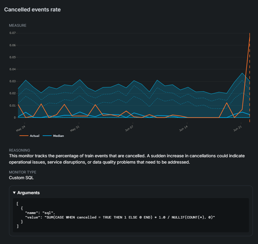
That shaded band is the part most tools hide from you. It's every quantile bound AIMO learned from the table's own history — not a threshold I typed in, but the range the data keeps itself inside. Here that's a cancellation rate drifting somewhere between zero and three percent, day after day. Finnish trains are punctual, and the band knows it.
And then it isn't. On June 22 the orange line — the actual rate — jumps to nearly seven percent, more than double the top of the band. And that one is no data glitch, it's a true story; a track-system fault on the Helsinki–Riihimäki line near Jokela cancelled around two dozen long-distance trains that day.
So a value broke the bound, and the alert fired.

That's not a staged screenshot of a thing that happened once. It's live in the demo right now, on the same messy tables. And because the data is scraped daily, the exact numbers above will have moved on by the time you read this; but go look, and you'll find today's version of the same thing. Open the demo and chase one down yourself.
No login, because that's the honest version
I understand why most tools gate the demo behind a sales rep. But every wall between "I'm curious" and "I see how it works" costs you the people who, like me, judge a tool by clicking around, and quietly lose interest the moment they can't. And worse yet, the wall plants a question you really don't want in the reader's head: is it gated because it's too confusing to grasp without a guide?
So the demo is the whole product; not a sandbox, not a video. It's AIMO in its entirety, on a real account with real tables already loaded. There's nothing to protect there, so it's read-only, and it's cached to stay fast even when a lot of people poke at it at once. That's the entire pitch: open it, click around, and make up your own mind.
It's also the most honest version of a value we'd otherwise just be asserting. Data quality is, in the end, about trusting your data; and you can't command trust with fancy words. You live it through and through, or you don't. So we take the openness as far as it goes: the technology choices and why we made them, the agent code (it's open source), the quantile bounds (all of them, on screen, not buried under one score), and how the thing works in detail, so you're never left guessing. An open demo is just that value, made clickable.
The thing everyone agrees they should do
Data-quality monitoring is one of those things every data team nods along to. Yeah, we should have that — and most never get to it. You either adopt a tool, or you build your own, and anyone who has built one knows what it costs in time and money. So if we want teams to actually do the thing they already agree they should, the job of our industry is to make adoption easy; not to stack walls between curiosity and a working tool.
So there are none here. Open the demo and see if it catches the kind of mess your data has. If it does, tell us about your data — we're taking pilots now. And if you'd rather read how it works first, the docs and FAQ hold nothing back.